Enhanced annotation of a primate phylogeny with ggtree
11 May 2017The ggtree package on Bioconductor is a welcome extension of ggplot2 for visualizing and annotating phylogenies. Its best feature is the ability to easily annotate trees with text, labels, images, and most excitingly, plots within plots (i.e., subplots). For example, you can annotate internal nodes with histograms to display posterior distributions of continuous ancestral state estimates, or you can annotate tips with scatterplots depicting within-speies allometric relationships.
In this tutorial, I build some fancy primate phylogeny plots that demonstrate the features of ggtree I have found most useful for displaying comparative data and the results of ancestral state reconstructions (ASRs). Although I don’t cover the full breadth of the ggtree vignette, I do go a bit beyond the vignette in a couple of places (e.g., providing a function to annotate multiple nodes with different external images). A thorough overview of ggtree capabilities can be found in the package vignette, and tutorials written by the package author here and here.
Preparations
Install phytools from CRAN, and EBImage and ggtree from Bioconductor. Then load the packages:
# install from CRAN
install.packages("phytools")

# install from Bioconductor
source("https://bioconductor.org/biocLite.R")
biocLite("EBImage")
biocLite("ggtree")

# load packages
library("phytools") # for sims and ASRs
library("EBImage") # for images
library("ggtree")
Import the primate phylogeny from GitHub (this tree originally came from 10kTrees):
# read the tree from GitHub
tree <- read.nexus("https://raw.githubusercontent.com/rgriff23/Dissertation/master/Chapter_2/data/tree.nex")
Basics
The simplest ggtree plot displays only branches:
# basic plot
p1 <- ggtree(tree)
plot(p1)
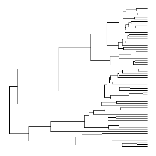
The layouts available in ggtree are basically the same as those available in ape’s plot.phylo function, although the names are different. Here are all the layouts, and also a demonstration of how to use multiplot:
# show different layouts in multiplot
p2a <- ggtree(tree, layout="rectangular") + ggtitle("rectangular")
p2b <- ggtree(tree, layout="slanted") + ggtitle("slanted")
p2c <- ggtree(tree, layout="circular") + ggtitle("circular")
p2d <- ggtree(tree, layout="radial") + ggtitle("radial")
p2e <- ggtree(tree, layout="unrooted") + ggtitle("unrooted")
multiplot(p2a, p2b, p2c, p2d, p2e, ncol=3)
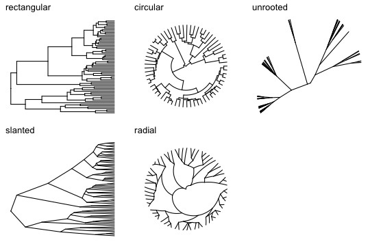
We have to add all other features related to the nodes, tips, and branches. This can be done by adding layers to the basic plot. Here are some layers demonstrating a few more aesthetic options:
# add tip labels (making room with xlim first), node labels, background color,
# branch colors (based on branch legths), and a legend for the branch colors
p3 <- ggtree(tree, aes(color=branch.length)) +
  xlim(0, 90) +
  geom_tiplab(size=2, color="plum1") +
  geom_label2(aes(subset=!isTip, label=node), size=2, color="darkred", alpha=0.5) +
  theme_tree2("black") +
  scale_color_continuous(low='white', high='hotpink', name="Branch length (my)") +
  theme(legend.position="bottom")
plot(p3)
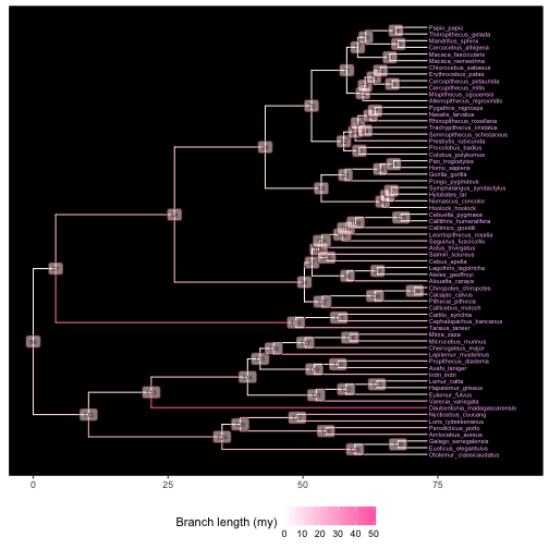
This plot will be useful for identifying the node numbers necessary to label or draw attention to clades in the next section.
Annotating clades
Using the last plot, we can find the internal node numbers corresponding to the primate superfamilies:
- Node 124: Galagoidea
- Node 113: Lemuroidea
- Node 110: Tarsioidea
- Node 96: Ceboidea
- Node 89: Hominoidea
- Node 70: Cercopithecoidea
There are a couple of approaches we can take to delineate the clades of interest. One is to add shaded regions around them using geom_hilight:
# highlight clades
p4 <- ggtree(tree) +
  xlim(0, 125) +
  geom_tiplab(size=2, offset=0.5) +
  geom_hilight(node=124, fill="steelblue", alpha=0.5) +
  geom_hilight(node=113, fill="darkgreen", alpha=0.5) +
  geom_hilight(node=110, fill="gray", alpha=0.5) +
  geom_hilight(node=96, fill="pink", alpha=0.5) +
  geom_hilight(node=89, fill="beige", alpha=0.5) +
  geom_hilight(node=70, fill="yellow", alpha=0.5)
plot(p4)
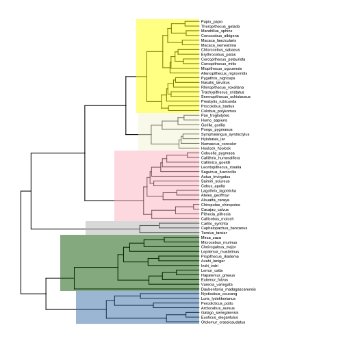
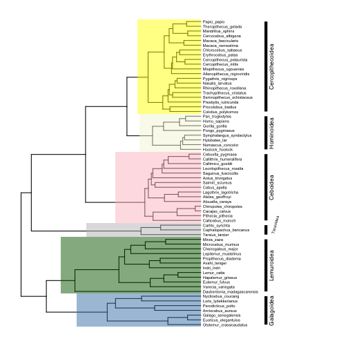
Another would be to add labeled bars near the tips of the tree that show the extent of each clade (note how I adjust the text size and position for the small Tarsiidae superfamily):
# label clades
p5 <- p4 +
  geom_cladelabel(124, "Galagoidea", offset=25, barsize=2, angle=90, offset.text=1.5, hjust=0.5, fontsize=3) +
  geom_cladelabel(113, "Lemuroidea", offset=25, barsize=2, angle=90, offset.text=1.5, hjust=0.5, fontsize=3) +
  geom_cladelabel(110, "Tarsioidea", offset=25, barsize=2, angle=75, offset.text=2.5, hjust=0.2, fontsize=2) +
  geom_cladelabel(96, "Ceboidea", offset=25, barsize=2, angle=90, offset.text=1.5, hjust=0.5, fontsize=3) +
  geom_cladelabel(89, "Hominoidea", offset=25, barsize=2, angle=90, offset.text=1.5, hjust=0.5, fontsize=3) +
  geom_cladelabel(70, "Cercopithecoidea", offset=25, barsize=2, angle=90, offset.text=1.5, hjust=0.5, fontsize=3)
plot(p5)
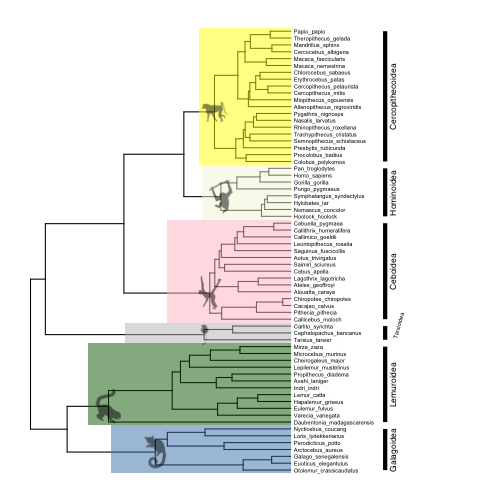
Finally, we can label our clades with images. For an elegant look, import images from the phylopic.org database, which ggtree is designed to work with using the phylopic function. To annotate nodes with phylopic, first find the number of each node you want to annotate, then match each node with a link to an image on phylopic.org. It is a bit strange, but to point to the images, you have to provide the ‘phylopic_id’ argument, which is the string of letters and numbers that comes after the http://phylopic.org/image/ part of the url for the image you want. So for example, if I want to use the image of a chimpanzee at this url:
http://phylopic.org/image/f06b4dd0-094e-4f37-9105-25fdb4eb1b02/
Then the phylopic_id argument would be set to "f06b4dd0-094e-4f37-9105-25fdb4eb1b02".
Here are the subpaths to images I want to use for the major primate superfamilies:
- Galagoidea (124): “7fb9bea8-e758-4986-afb2-95a2c3bf983d”
- Lemuroidea (113): “bac25f49-97a4-4aec-beb6-f542158ebd23”
- Tarsioidea (110): “f598fb39-facf-43ea-a576-1861304b2fe4”
- Ceboidea (96): “aceb287d-84cf-46f1-868c-4797c4ac54a8”
- Hominoidea (89): “0174801d-15a6-4668-bfe0-4c421fbe51e8”
- Cercopithecoidea (70): “72f2f854-f3cd-4666-887c-35d5c256ab0f”
Now add the images to the plot.
# add phylopic images
p6 <- phylopic(p5, "7fb9bea8-e758-4986-afb2-95a2c3bf983d", node=124) # galagoids
p6 <- phylopic(p6, "bac25f49-97a4-4aec-beb6-f542158ebd23", node=113) # lemurs
p6 <- phylopic(p6, "f598fb39-facf-43ea-a576-1861304b2fe4", node=110) # tarsiers
p6 <- phylopic(p6, "aceb287d-84cf-46f1-868c-4797c4ac54a8", node=96) # cebids
p6 <- phylopic(p6, "0174801d-15a6-4668-bfe0-4c421fbe51e8", node=89) # hominoids
p6 <- phylopic(p6, "72f2f854-f3cd-4666-887c-35d5c256ab0f", node=70) # cercopithecoids
plot(p6)
Adding images from sources other than phylopic is a bit annoying to code, but it is possible. There is some code in the package author’s “Advance Tree Annotation” tutorial that shows how to add a single external image to multiple nodes, but the code does not make it easy to add multiple different images to different nodes at once. I managed to do it by writing a function that loops over vectors of node numbers and urls of the images you want to add, and iteratively adds them to a plot using the inset function. Here is how I added Pokemon node labels from images on imgur:
# define function for adding external images to nodes
add.images <- function (plot, nodes, images) {
  p <- plot
  for (i in 1:length(images)) {
   imgfile <- tempfile(, fileext=".png")
   download.file(images[i], destfile=imgfile, mode='wb')
   names(imgfile) <- nodes[i]
   p <- inset(p, imgfile)
  }
  return(p)
}

# define vector with node numbers as character strings
nodes <- c("70","89","96","110","113","124")

# define vector with urls to images
images <- c("https://i.imgur.com/8VA9cYw.png",
            "https://i.imgur.com/XYM1T2x.png",
            "https://i.imgur.com/EQs5ZZe.png",
            "https://i.imgur.com/2xin0UK.png",
            "https://i.imgur.com/hbftayl.png",
            "https://i.imgur.com/3wDHW8n.png")

# add images
p7 <- add.images(p5, nodes, images)

# plot
plot(p7)
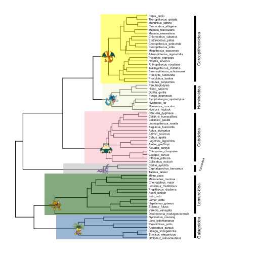
(In case you are wondering, that is my winning Blue Version team from the early 2000s)
In general, inset accepts a list of ggplot graphic objects (they need not be the same type of object) and adds them to a ggtree plot. You can add any ggplot object you wish to your plot using this function. We will see several more uses of inset below.
Annotating tips with comparative data
Simulate some comparative data with phytools- let’s do 5 continuous Brownian motion traits:
# simulate 5 continous BM traits
set.seed(23) # reproducible
traits <- data.frame(fastBM(tree, nsim=5))
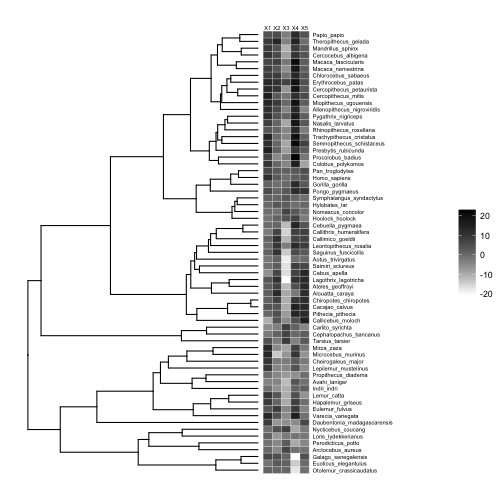
We can use gheatmap to display the data matrix on the tips of the tree:
# basic plot
p8 <- ggtree(tree) +
  xlim(0, 125) +
  geom_tiplab(size=2, offset=17)

# add heatmap
p9 <-  gheatmap(p8, traits, offset=0.2, width=0.2, low="white", high="black", colnames_position = "top", font.size=2)

# plot
plot(p9)
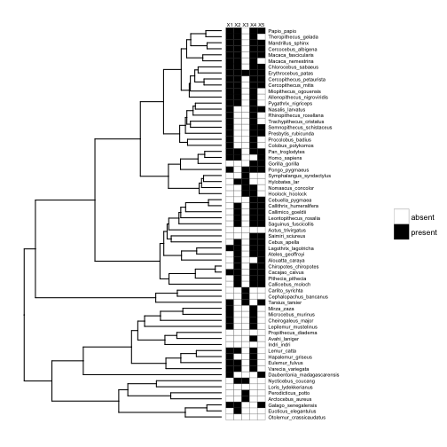
This works just as well if our traits are binary, e.g., presence-absence data.
# make traits binary (presence-absence)
traits.binary <- data.frame(matrix(ifelse(stack(traits)$values > mean(stack(traits)$values), "present", "absent"), 65, 5))
row.names(traits.binary) <- row.names(traits)

# add heatmap
p10 <-  gheatmap(p8, traits.binary, offset=0.2, width=0.2, low="white", high="black", colnames_position = "top", font.size=2, color="black") +
    scale_fill_manual(values=c("white", "black"))

# plot
plot(p10)
What if instead of having multiple variables per species, we have within-species samples for a single variable (e.g., multiple body mass measures for each species), and we want to display the distribution of that variable for each species? This brings us to the biggest advantage of ggtree: the ability to create plots within your phylogeny plots, or ‘subplots’.
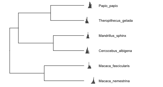
Figures with subplots can quickly become overcrowded, so I will first trim the tree to just 6 primates, and then simulate continuous within-species data distributions for each species:
# extract subtree with 6 species
sub <- extract.clade(tree, 77)

# simulate within-species variation
means <- fastBM(sub, nsim=1)
d <- lapply(means, rnorm, n=100)
bx <- lapply(d, function(y) {
    ggplot(data.frame(y=y), aes(y)) +
    geom_histogram(binwidth = 0.3) +
    xlim(range(unlist(d))) +
    theme_inset()
})

# names need to be node/tip numbers
names(bx) <- 1:length(means)

# plot trees with continuous and discrete tip data
psub <- ggtree(sub) +
  xlim(0,25) +
  geom_tiplab(offset=2.5, size=4)
inset(psub, bx, width=0.2, height=0.15, hjust=-1)
Displaying ASRs with subplots
Now we will simulate a single continuous trait, perform ancestral state reconstructions (ASRs), and visualize the results across nodes. First, simulate and estimate the ASRs for a continuous trait using the anc.Bayes function from phytools:
# simulate single trait
set.seed(23) # reproducible
trait <- fastBM(tree)

# estimate continuous ASRs with Bayesian Brownian motion model
asr.cont <- anc.Bayes(tree, trait)
  List of 7
   $ sig2   : num 0.857
   $ a      : num [1, 1] 2.97
   $ y      : num [1:63] 2.97 2.97 2.97 2.97 2.97 ...
   $ pr.mean: num [1:65] 1000 0 0 0 0 0 0 0 0 0 ...
   $ pr.var : num [1:65] 1e+06 1e+03 1e+03 1e+03 1e+03 1e+03 1e+03 1e+03 1e+03 1e+03 ...
   $ prop   : num [1:65] 0.626 0.626 0.626 0.626 0.626 ...
   $ sample : num 100
For the continuous trait, ancestral states are represented by continuous posterior distributions that can be visualized with histograms. We can annotate our nodes of interest with histograms of the corresponding posterior distributions:
# basic tree plot
p11 <- ggtree(tree) +
  xlim(0,100) +
  geom_tiplab(offset=2.5, size=2)
p11 <-  gheatmap(p11, data.frame(trait), width=0.02, low="blue", high="red", colnames = FALSE)

# define vector with node numbers as character strings
nodes <- c("70","89","96","110","113","124")

# add continuous ASR posterior distributions for selected nodes
pd <- asr.cont[,nodes]
pdplots <- apply(pd, 2, function(y) {
    ggplot(data.frame(y=y), aes(y, fill=..x..)) +
    geom_histogram(binwidth = 0.5, alpha=0.75) +
    xlim(range(unlist(pd))) +
    scale_fill_gradient(low = "blue", high = "red") +
    theme_inset()
})

# plot
inset(p11, pdplots, width=0.15, height=0.15, vjust=-1)
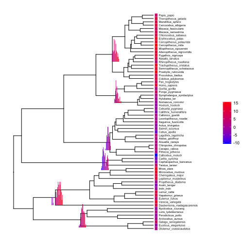
Setting the aesthetic fill=..x.. and using scale_fill_gradient with the same low and high colors as our gheatmap allows us to plot minimalistic histograms that use color shading to achieve what we usually achieve with an x-axis.
If we have ancestral state reconstructions for a discrete trait, ancestral states can be represented by a pie chart or bar chart depicting the relative probability of each state. Let’s use a continuous time Markov model to reconstruct ancestral states for our first discrete character, and visualize the results with pie charts at each internal node:
# make trait binary
trait.bi <- ifelse(trait > mean(trait), 1, 0)

# estimate discrete ASRs with
asr.bi <- data.frame(rerootingMethod(tree, trait.bi)$marginal.anc)

# add column of node numbers
asr.bi$node <- row.names(asr.bi)

# basic tree
p12 <- ggtree(tree) +
  xlim(0,100) +
  geom_tiplab(offset=2.5, size=2)

# add heatmap
p12 <- gheatmap(p12, data.frame(factor(trait.bi)), offset=0.02, width=0.02, low="darkorange1", high="blue", colnames = FALSE, font.size=2, color="black") +
  scale_fill_manual(values=c("darkorange1","blue"))

# plot discrete ASRs with pie charts
pies <- nodepie(asr.bi, cols=1:2, color=c("darkorange1","blue"), alpha=0.8)
p12 <- inset(p12, pies)
plot(p12)
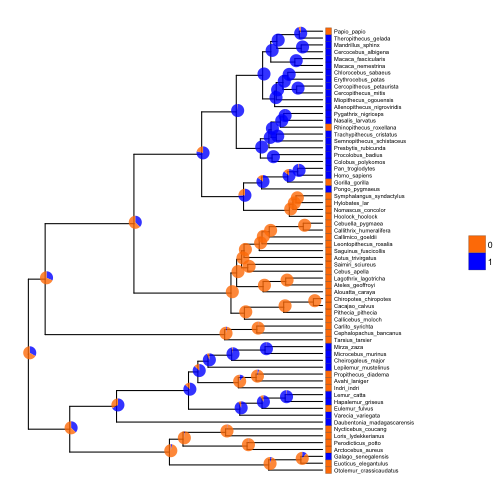
The function nodebar works similarly to nodepie, but produces stacked or unstacked barcharts.
Concluding remarks
If you are in the business of plotting phylogenies, I think mastering ggtree is worth the effort. The downsides are that there is a learning curve if you are not familiar with ggplot, and it can be a little harder to find help because it isn’t as widely used alternatives (e.g., plot.phylo from the ape package). I note that phytools (which we used here to simulate data and reconstruct ancestral states) also has some interesting functions for visualizing phylogenetic comparative data and ancestral state reconstructions- see this demo. However, as a general R toolkit for annotating phylogenies, ggtree is the most powerful and flexible option I am aware of.
Footnotes
Yu G, Smith D, Zhu H, Guan Y and Lam TT (2017). “ggtree: an R package for visualization and annotation of phylogenetic trees with their covariates and other associated data.” Methods in Ecology and Evolution, 8, pp. 28-36. doi: 10.1111/2041-210X.12628.
